Designing a Brand With Personality: How Playful Branding Brought Pink Clover Studio to Life

Some brands whisper, but not Pink Clover Studio. It laughs, dances, and throws confetti in the air.
From the moment Kate reached out about her bright, creative photography studio in Windham, New Hampshire, I knew this project was going to be a joyful adventure in playful branding. And it wasn’t just because of the mood board she had flushed out for the space, but also because we already had the best time working on the brand and website for her photography business.
Kate didn’t just want “a logo and a website” for either brand. And for Pink Clover, she wanted the entire vibe to feel like stepping into a mood: bold, colorful, feminine, and fun. A place where creativity feels contagious and every corner inspires you to make something magical.
Pink Clover Studio: A Photography Studio with Playful Branding That Inspires
Pink Clover Studio is a bright, airy photography studio created by Kate to serve entrepreneurs, photographers, and creatives in Windham, New Hampshire and beyond. It’s more than a backdrop for photoshoots. It’s a community space where photographers to host mini sessions and client shoots and creatives can gather, collaborate, and get inspired.
Kate’s vision was crystal clear from our first conversation: she wanted Pink Clover Studio to feel like a breath of fresh air. No sterile, all-white, “you-could-be-anywhere” studio vibes. She dreamed of a space that would instantly boost your mood the second you walked in or landed on the homepage.
She needed branding and a website that told the full story: playful, bold, inspiring, and deeply creative. That’s where our collaboration of brand magic began.
Defining the Playful Brand Personality: Fun, Feminine, and Fearlessly Creative
Before we picked a single color or sketched a single logo, we dove into the heart of the brand: the personality. This is one of the most important parts of playful branding because it’s not just about bright colors and cute fonts. It’s about intention.
For Pink Clover Studio, we defined key brand traits as:
- Playful and upbeat: the kind of energy that makes people feel instantly welcome.
- Bold and confident: not afraid of color, pattern, or standing out where it makes sense.
- Feminine and modern: soft edges, but with an edge.
- Inspiring and uplifting: a space and brand where creative blocks go to die and big ideas come to life
We talked about how Kate wanted people to feel: energized, supported, and a little bit braver with their creativity. Whether someone is a seasoned photographer or a small business owner planning their very first brand shoot, the brand needed to whisper, “You belong here. Let’s make something beautiful.” And
every decision from that point had to support that experience.
Building Out a Brand Suite That Feels Playful and Chic
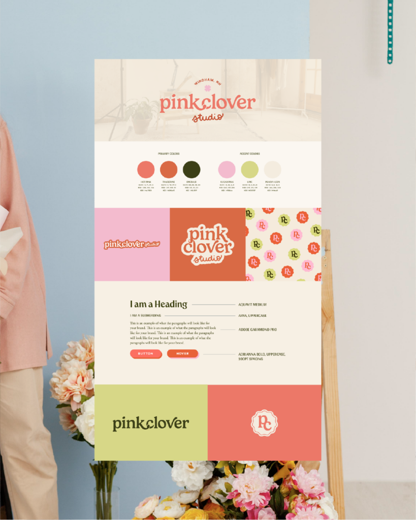
Build a Color Palette for Playful Branding
You can’t talk about Pink Clover Studio without talking about color. This brand is unapologetically vibrant, and the palette became the anchor for the entire identity:
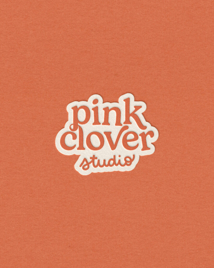
- Pink as the hero, and not just any pink, but a range of pinks: warm, orangey-pink, and richer pink-red tones that feel energetic and youthful without tipping into chaotic.
- Cream as a soft, neutral, warm, cozy base that balances all the brightness and keeps the brand feeling polished and approachable
- Playful greens as accents to add contrast, freshness, and a hint of Kate Fleming-inspired calm amidst all the boldness.
In playful branding, color does a lot of heavy lifting. For Pink Clover, it instantly communicates that the brand is a fun place to be where you’re allowed to play and experiment.
The Typography
Once the color story was in place, we moved into the brand identity system: logo, typography, and those little details that make everything feel cohesive and custom.
For typography, we choose a friendly, expressive display typeface for headings, something with character and movement that instantly says, “Hey, we’re fun over here.” We paired that with a clean, modern sans-serif for body copy to keep everything readable, professional, and grounded.
This balance ensured the brand felt both playful and polished: equal parts creative studio and serious business.
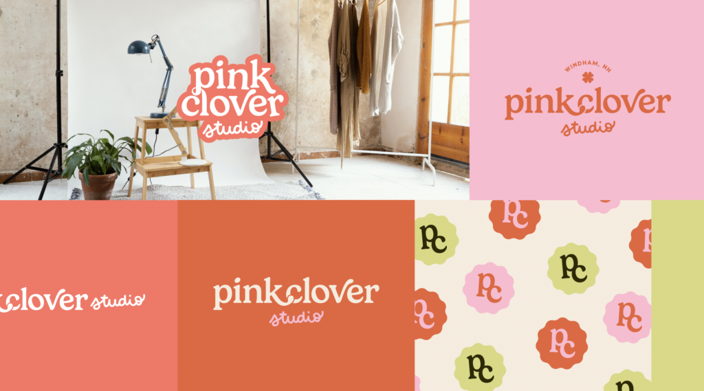
The Logo Suite and Website Design for Pink Clover Studio
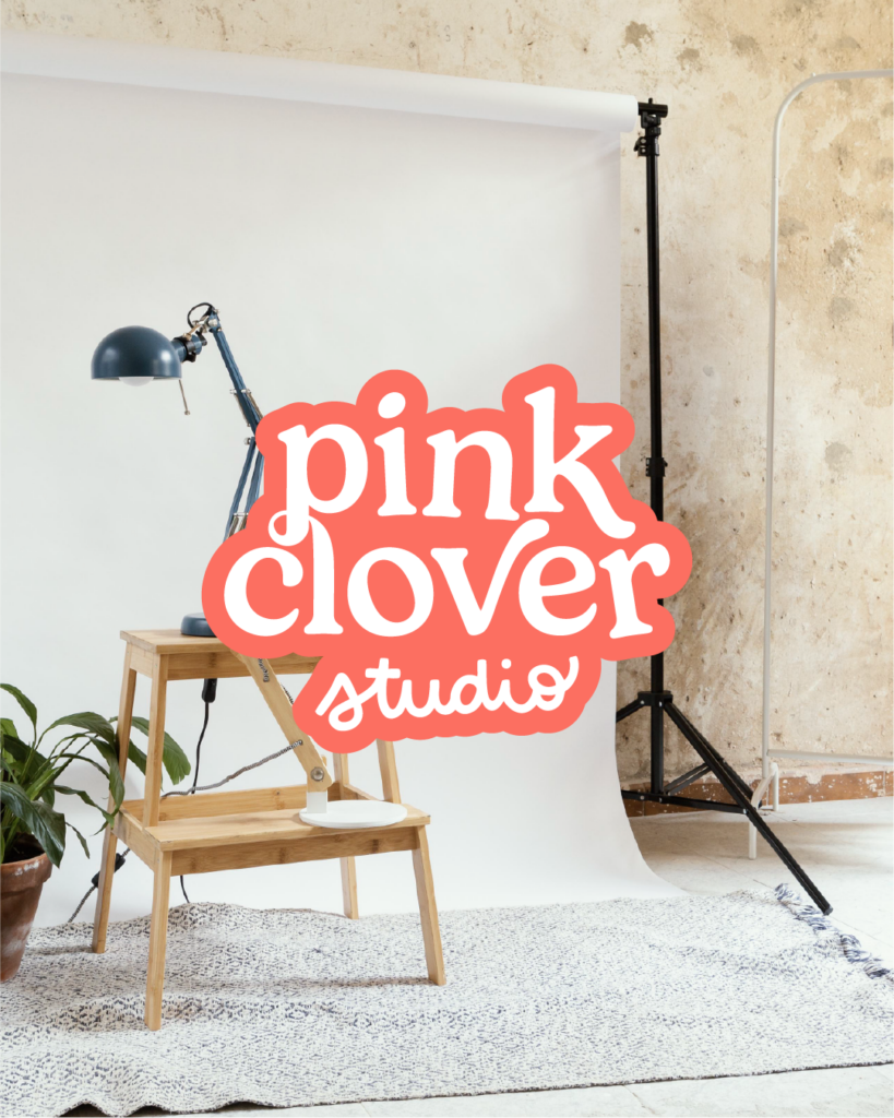
The logo and supporting marks leaned into the “Pink Clover” name with soft curves, custom touches, and a sense of whimsy. Rather than a rigid, corporate-style mark, we created something that could flex across the brand on signage, social graphics, the website, and even studio details.
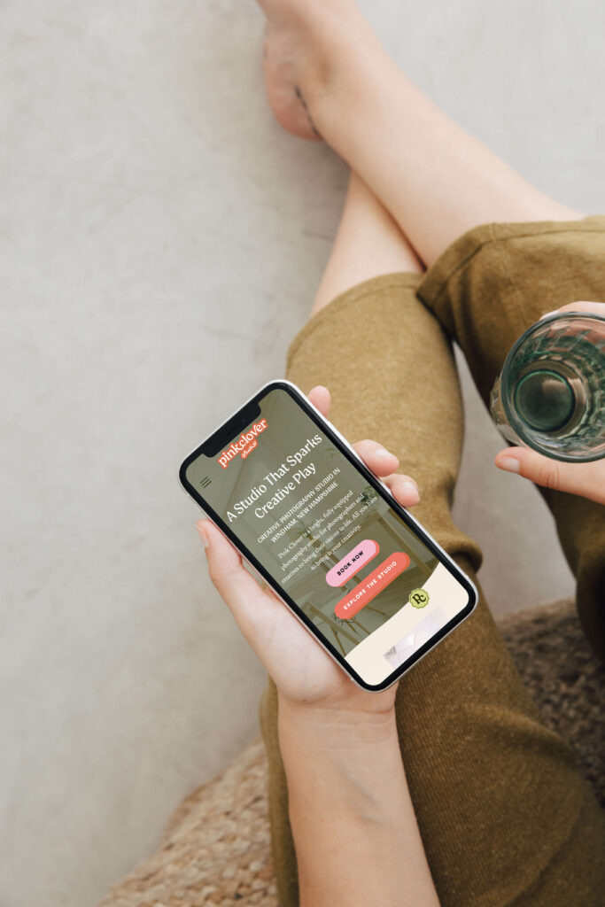
Kate’s biggest request for the website? “I want people to land here and immediately feel how fun and inspiring the studio is.”
So we treated the website like a digital extension of the actual space. If you can’t yet walk into Pink Clover Studio, you can at least experience the personality from your screen.
A few ways we brought that to life:
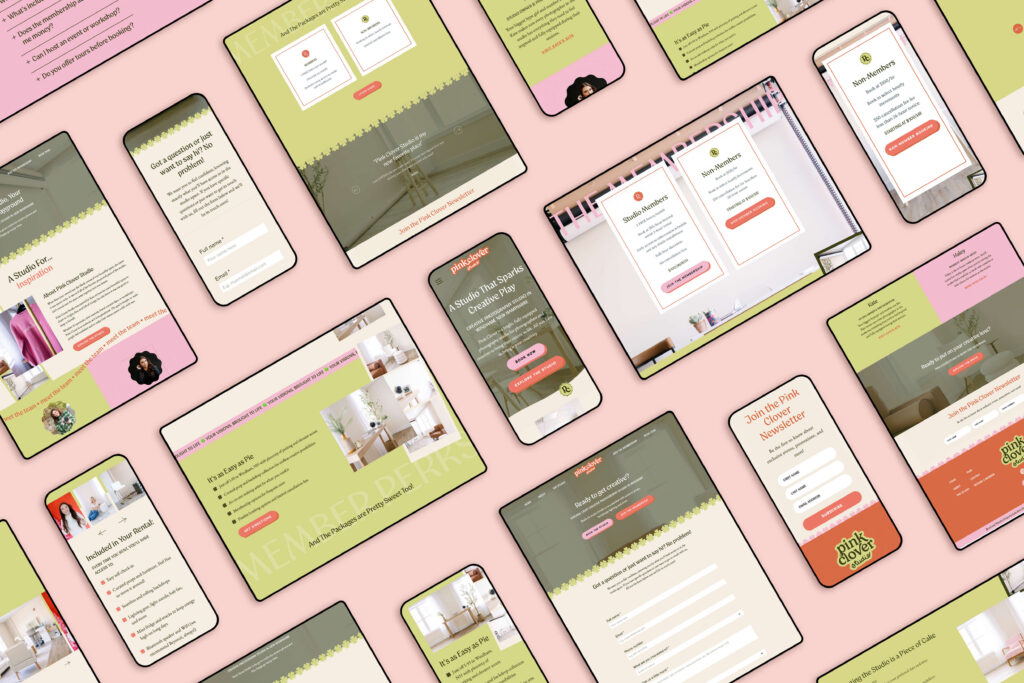
- Scroll effects and animations: Subtle movement adds dimension and play. Sections slide in, images float up, and elements animate as you move down the page keeping it engaging and fun
- Color-blocked sections: Bold pinks, creamy neutrals, and playful greens frame content, making each section feel like its own little moment without losing cohesion.
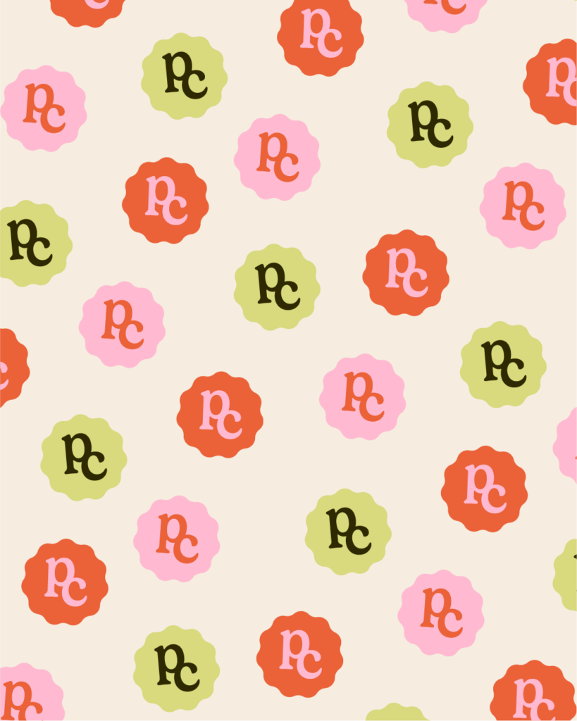
- Custom borders: My favorite part of the Pink Clover Studio site aside from the animations is the custom clover shape borders. They add the perfect touch of whimsy and play without adding unnecessary clutter to the site.
- Photography-forward design: We made sure the images could shine. After all, this is a photography studio!
We built the site to be equal parts beautiful and user-friendly. Because playful branding only works when people can actually navigate, book, and get the information they need without friction. You can explore the full Pink Clover Studio brand and website here:
Aligning Playful Branding With The Studio Space
One of my favorite parts of this project was how seamlessly the brand visuals aligned with the physical studio. Kate had already poured her heart into styling the space: bright pink accents, fun décor, cozy details, and thoughtful props that make shoots feel easy and creative.
When a photographer discovers Pink Clover on Instagram, visits the website, and then walks into the studio, there’s no disconnect. Everything feels like one continuous story. That kind of alignment builds trust. It reassures your clients that what they see is what they’ll get.
Why Playful Branding Works for Serious Businesses
There’s a misconception that if you want to be taken seriously, your brand has to be neutral, minimal, and a tiny bit boring. Pink Clover Studio is living proof that playful branding can absolutely coexist with professionalism.
Here’s why playful branding works so well:
- It attracts the right people. The bold, fun aesthetic instantly draws in creatives, photographers, and entrepreneurs who want a colorful, modern space, not a completely blank box.
- It sets clear expectations. Visitors know, before they ever inquire, that this is a fun, imaginative environment. That clarity makes the booking decision easier.
- It gives you a memorable edge. In a sea of similar studio spaces and brands, a distinct personality helps you stand out and be remembered.
If your business is built around creativity, connection, joy, or community, playful branding might be the exact thing you need to visually communicate that. The key is doing it intentionally, not just throwing color at the wall and hoping it sticks.
You don’t need a photography studio full of pink walls to have a personality-filled brand. You just need clarity on who you are, who you serve, and how you want people to feel.
When I work with clients, especially female founders and creative entrepreneurs, we always start with questions like:
- What words do you want people to use when they describe your brand?
- How do you want your clients to feel before, during, and after working with you?
- What makes you different from others offering a similar service?
From there, we translate those answers into visuals: color, typography, layout, imagery, and digital experiences that mirror your personality and values.
Pink Clover Studio Brand Case Study
Pink Clover Studio is a beautiful example of what happens when you give yourself permission to lean all the way into what makes you different. Instead of watering down her idea to appeal to “everyone,” Kate doubled down on color, creativity, and community, and the brand now reflects that in every detail.
If you’re dreaming of a brand and website that feel like you… playful, bold, polished, and unmistakably yours… that’s exactly the kind of work I love to create with clients.
Designing a brand with personality isn’t about following trends or copying what that other business owner you admire is doing. It’s about turning up the volume on your own voice. With Pink Clover Studio, we used playful branding to build a visual world that feels like stepping into Kate’s creative universe: warm, inviting, energizing, and uniquely her.
If you’re ready for a brand and website that feel less “generic template” and more “this is so me,” I’d love to help you bring that vision to life.


Favorite Resources
Back to the Blog
Our Services
Read more from the blog for more glimmers of creative inspiration from the KBD studio.
Explore our services for custom brand and website magic designed to help you shine in your niche.
Discover our favorite resources of must-have tools, trusted partners, and exclusive affiliate links.

