Brand Color Palette: How to Choose Colors That Exude Confidence and Charm

There’s nothing sweeter than getting that excited message from a client after they’ve seen their brand color palette for the first time. The all-caps messages, the heart emojis, the “this feels SO me” replies, you can feel the joy radiating right through the screen. That’s the magic of a thoughtfully chosen palette: it’s not just about pretty colors, it’s about creating something that feels like home and perfectly reflects who they are and what their business stands for.
As business owners, we’re constantly bombarded with color trends. One season it’s millennial pink, the next it’s sage green, and suddenly everyone’s using terracotta. But the truth I’ve learned after years of creating brands for entrepreneurs like many of you, the most successful palettes aren’t about following what’s trendy. They’re about understanding color theory, knowing your unique personality, and creating something that will feel just as authentic and captivating five years from now as it does today.
Understanding Color Theory for Modern Branding
Color theory might sound intimidating, but at its heart, it’s really about understanding how colors work together and what emotions they naturally evoke.
The color wheel is your best friend here. Colors that sit opposite each other (complementary) create vibrant, high-energy combinations that demand attention. Colors sitting next to each other (analogous) create harmony and flow, feeling more cohesive and soothing. And colors forming a triangle on the wheel (triadic) offer balanced contrast while maintaining visual interest.
But there’s more to it than what looks good together. Every color carries psychological weight. Warm tones like reds, oranges, and yellows tend to feel energetic, passionate, and attention-grabbing. They’re the extroverts of the color world, more bold, confident, and impossible to ignore. Cool tones like blues, greens, and purples feel calming, trustworthy, and sophisticated. They’re the thoughtful, reliable friends who make you feel safe and understood.
When developing your palette, understanding these psychological associations helps you communicate the right message before anyone even reads your copy. A wellness coach might gravitate toward calming blues and nurturing greens, while a business strategist might embrace confident reds and sophisticated blacks. Neither choice is right or wrong, it’s about what authentically represents your personality and speaks to your dream clients.
The important thing to keep in mind is moving beyond just personal preference (though that matters too) and thinking strategically about what you need to communicate. What do you want people to feel when they interact with you? What emotions align with the transformation you provide? These questions guide you toward choices that don’t just look beautiful but actually work hard for your business.
Moving Away From Trends and the Things You “Like”
Here’s where things get really interesting (I’m a nerd for color theory, okay). We all have colors we’re naturally drawn to. Maybe you’ve always loved blush pink, or navy blue makes your heart sing. And while those personal preferences absolutely matter (you should love what you create, after all), building something strategic requires looking beyond just what we personally like.
Trends are tempting too. When you see everyone in your industry using similar shades, it’s natural to think “maybe I should use those too.” But when you follow trends, you blend in rather than stand out, and that’s exactly what we want to avoid. Your colors should help you become the go-to leader in your niche, not just another voice in an already crowded space.
Instead of chasing what’s popular, focus on timelessness with personality. This doesn’t mean boring or safe, it means choosing hues that have staying power while still feeling distinctly you. Think about brands you admire that have maintained the same look for years. They work because they’re rooted in strategy and authenticity, not fleeting trends.
The best approach balances what you love with what your ideal clients need to see. Maybe you adore bright orange, but your luxury wedding planning business needs something more refined. Or perhaps you think your therapy practice should use muted neutrals, but your clients actually need to see warmth and approachability. Finding that sweet spot between personal preference, industry expectations, and strategic communication is where the magic happens.
Consider your industry and audience, but don’t let them box you in completely. A financial advisor can absolutely use softer, more approachable tones if that aligns with their personality. A children’s brand doesn’t have to use primary colors if sophisticated pastels better represent their aesthetic. The most memorable looks often come from thoughtfully breaking expectations while still meeting your audience where they are.
How to Maintain a Cohesive Brand Vibe
One of the most important aspects of creating a successful system is making sure all your colors work together to support a unified vibe. Your selections aren’t just a collection of pretty shades, they’re a carefully orchestrated system that communicates your personality consistently across every touchpoint.
Let’s break down how to curate palettes for different vibes with three distinct examples. Each demonstrates how color theory principles can be applied to create specific emotional responses while still maintaining that timeless yet creative appeal.
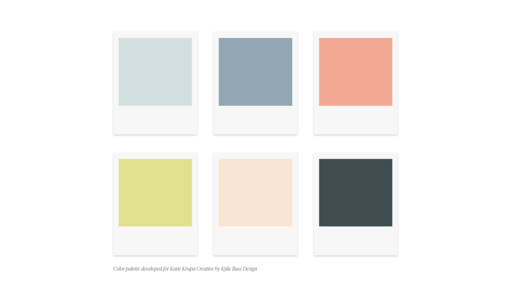
Example 1: Edgy, Bold, and Unapologetically Confident
When you want to feel edgy, bold, and unapologetically different, your choices need to make a statement the second they appear on screen. This palette is perfect for challenging the status quo, appealing to adventurous clients, or positioning yourself as an industry disruptor.
For this type of energy, we’d lean into deep, saturated tones that command attention. Think rich blacks or charcoals as the foundation, these create immediate sophistication and authority. Then we’d layer in pops of color that feel more modern and daring. Maybe it’s an electric yellow that feels innovative, or a bold magenta that’s feminine and fierce. The magic lies in the contrast, high-saturation shades that create visual tension.
We’d avoid anything too soft or muted, instead embracing decisiveness and power. Metallics like gold or silver might make an appearance, adding that extra edge and premium feel. The overall effect should feel like confidence personified, knowing exactly who you are and not being afraid to show it.
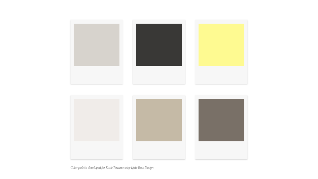
Example 2: Feminine, Romantic, and Timelessly Elegant
For a feminine, romantic, and elegant brand, things take on a completely different character. This aesthetic works beautifully for wedding professionals, luxury service providers, boutique owners, or anyone wanting to create an experience that feels refined and enchanting.
Here, we’d build around softer, more sophisticated tones. Blush pinks that lean toward mauve rather than bubblegum, creating that grown-up feminine feel. Warm creams and soft ivories provide elegant neutrals that feel luxurious without being stark. Then we’d add depth with dusty rose, sage green, or soft lavender—shades that feel romantic but not overly sweet.
You want to maintain sophistication while still embracing femininity. We want colors that whisper rather than shout, that invite rather than demand. Each should feel like it could live in a French countryside chateau or a modern elegant loft, that perfect balance of timeless and contemporary. The overall feeling should be like a beautiful exhale, creating space for your ideal clients to envision themselves in the experience you’re creating.
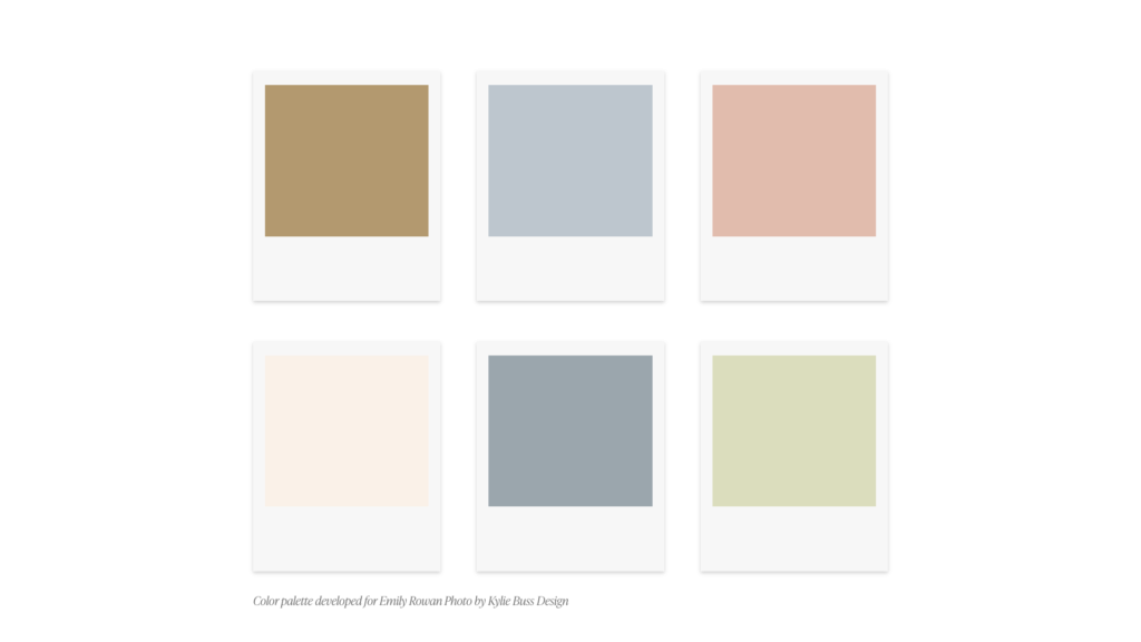
Example 3: Energetic, Playful, and Warmly Approachable
When you need to feel energetic, playful, and genuinely approachable, your selections should radiate warmth and positive energy while maintaining professionalism. This palette is perfect for coaches, educators, creative entrepreneurs, or service providers who want their presence to feel like a warm hug and an exciting adventure all at once.
For this energy, we’d embrace warm, saturated tones that feel alive and optimistic. Maybe it’s a vibrant coral that feels friendly and energizing, or a sunny golden yellow that radiates positivity. We’d ground these brighter shades with warm neutrals like rich terracotta, warm taupe, or creamy beige. These anchoring tones prevent things from feeling too juvenile while maintaining that approachable warmth.
The magic comes from balancing playful energy with enough sophistication to attract high-ticket clients. We want colors that make people smile and feel energized, but that still communicate expertise and professionalism. It’s that fun yet timeless combination, lighthearted but refined enough to be taken seriously. The overall effect should feel like sunshine and confidence wrapped together.
Best Practices for Implementation
Creating a successful color palette involves more than just picking shades you love. Here are the important practices that will help make sure everything works beautifully across all applications and stands the test of time.
First, limit yourself to 5-7 colors maximum, if you want to keep it simple 3 works perfectly fine. This typically includes one or two primary shades (your main identity), two to three secondary options (supporting), and one to two accents (for emphasis and variety). Having too many creates confusion and dilutes your identity, while too few limits creative flexibility.
Consider how things work in different contexts. Your selections need to look gorgeous on your website, but they also need to work on social media, printed materials, packaging, and anywhere else you appear. Test in both digital and print formats, some shades that look vibrant on screen can appear completely different when printed.
Think about accessibility too. Make sure there’s enough contrast between your choices for readability, especially between text and backgrounds. Your beautiful selections shouldn’t sacrifice usability. Tools like WebAIM’s contrast checker can help ensure combinations meet accessibility standards.
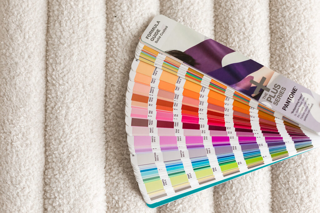
Document everything in a style guide. Specify the exact codes (hex, RGB, CMYK, and Pantone when relevant) for each shade. Include guidelines for when and how to use each one. This helps with consistency whether you’re creating content yourself or working with designers, printers, or other vendors.
Finally, give your system room to breathe and evolve. While your core should remain consistent, you might introduce seasonal accents or subtle variations as you mature. The goal is maintaining recognizable consistency while allowing for creative flexibility and growth.
Bringing Your Vision to Life
Your color palette is one of the most powerful tools in your brand. When curated thoughtfully using color theory principles, informed by strategy rather than trends, and designed to maintain a cohesive vibe, it becomes a silent ambassador communicating your personality, attracting your ideal clients, and helping you stand out as the go-to leader in your niche.
Remember, the most effective approach isn’t about following rules rigidly or copying what others are doing. It’s about understanding the principles, knowing your authentic personality, and creating something that feels true to you while strategically serving your business goals. Whether you’re drawn to bold and edgy, romantic and elegant, or energetic and playful, there’s a perfect combination waiting to bring your vision to life.
Trust the process, lean into color theory as your guide, and don’t be afraid to create something that makes your heart sing while charming your ideal audience. After all, when you confidently market your business with colors that truly represent you, that confidence radiates through everything you create, and your dream clients can absolutely feel it.

Leave a Reply


Favorite Resources
Back to the Blog
Our Services
Read more from the blog for more glimmers of creative inspiration from the KBD studio.
Explore our services for custom brand and website magic designed to help you shine in your niche.
Discover our favorite resources of must-have tools, trusted partners, and exclusive affiliate links.


