Feminine Branding: How Feminine Design Creates Impact and Professionalism
As business owners in the current online space, standing out isn’t just about being different, it’s about creating a memorable experience. Feminine branding proves that professional doesn’t have to mean predictable, and being polished doesn’t mean integrating zero personality. It’s about building a brand that feels as enchanting as it is strategic, something your dream clients can instantly connect with and remember.
Maybe it’s the playful hand-lettered script that feels like a note written just for you, or the soft blush tones that somehow balance warmth with sophistication. That’s the magic of feminine branding design, where whimsy meets authority, and strategy meets soul.
The Magic of Feminine Branding
Feminine branding isn’t about creating brands exclusively for women, it’s about embracing design elements traditionally associated with femininity to create more approachable, emotionally resonant brand experiences. This design philosophy celebrates curves over sharp angles, elegant serifs over rigid sans-serifs, and storytelling over statistics.
When executed thoughtfully, feminine branding creates an immediate emotional connection with your audience. It signals that behind your business is a human being who understands the importance of relationships, attention to detail, and creating experiences that feel personal rather than transactional.
The beauty of this approach lies in its versatility. Whether you’re a wedding planner, life coach, boutique owner, or even a tech consultant, incorporating feminine design elements can help set your brand apart while maintaining the professionalism your clients expect. It’s about finding that sweet spot between approachable and authoritative, what many successful entrepreneurs describe as being “polished but not intimidating.”
Typography Helps Tells Your Story
One of the most impactful elements of feminine branding is the use of typography. Hand-lettered scripts, flowing calligraphy, and organic letterforms do more than just spell out your business name, they communicate your brand’s personality before they even read a single word.
A script font immediately suggests attention to detail and a hands-on-approach, while a bold, hand-drawn wordmark conveys creativity and authenticity. These choices work because they mirror the human element in your business. They suggest that real hands crafted this brand, that real thought went into every curve and flourish.
To bring playful typography into your brand in a way that feels intentional, balance is everything.
That gorgeous hand-lettered script might work well as your accent font, but pairing it with clean, easy-to-read fonts makes sure your message stays clear and inviting. Think of your typography like a conversation: the supporting fonts are the steady, confident voice that shares your expertise with clarity, while the script is the warm smile that draws people in.
Many successful brands use a combination of 2 to 3 fonts to keep their brand unique and full of charm while ensuring everything, from their website to socials and business cards, stays clear and easy to read.
The Psychology of Soft Color Palettes
Color has a way of speaking straight to the heart, and in feminine branding design, it’s one of the most powerful tools we have.
Soft, sophisticated palettes like blush pinks, sage greens, warm creams, and dusty lavenders aren’t just beautiful; they quietly build trust and spark connection.

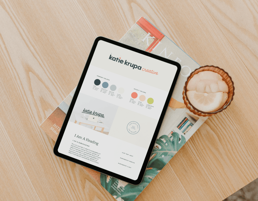
With Katie’s branding, we wanted something that felt feminine, but inspiring and a little bold. By focusing on bright hues with a gentler touch, we create what color psychologists call “approachability cues”, which invite people to pause, linger, and lean into your world. They feel refreshing, thoughtful, and grab your attention.
But it’s not that simple. Softer palettes tend to only work best when they’re paired with intention and strategy. A wash of blush pink on its own might feel too sweet for a consultant, but that same pink balanced with grounding tones like charcoal, warm brown, or deep forest green transforms into something that feels both warm and professional.
When feminine color palettes are done well, they blend playfulness vs. sophistication and lightness vs. depth easily. This results in a brand that feels approachable, elevated, and unmistakably you without feeling too whimsical for serious business applications.
Imagery That Maintains Authority
Imagery is a big part of your brand, and that doesn’t just mean photos from a session with your brand photographer. It can be illustrations, textures, certain filters, or even emojis that you use on repeat to tell your story and embrace it fully. Imagery in feminine branding is about choosing visuals that feel personal, authentic, and emotionally engaging.
Think hand-drawn illustrations, soft watercolor textures, organic patterns, or lifestyle photos that feel lived-in and real. These elements all contribute to a brand that feels human-centered rather than corporate-manufactured. And in a world that’s increasingly automated, that personal touch is exactly what people are craving.

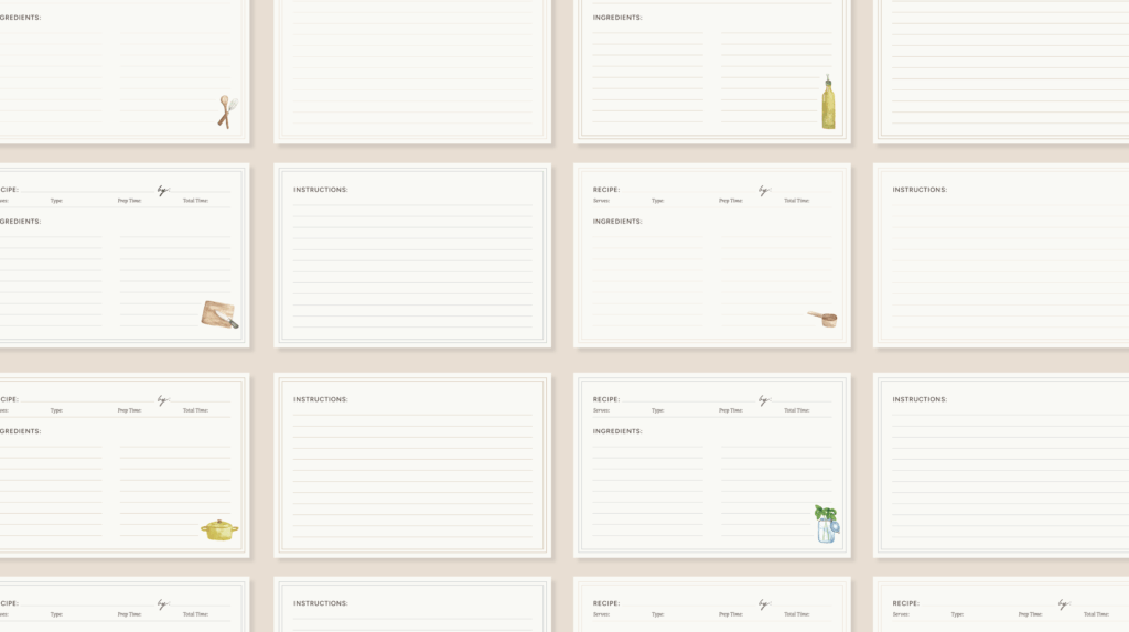
The secret to making whimsy feel professional is all in the execution and context. A set of hand-painted icons can feel sophisticated when paired with a refined color palette and used consistently across your entire brand. A watercolor brand pattern can add just the right touch of creativity without sacrificing credibility when they’re subtle and purposeful rather than overwhelming.
Photography plays an important role in feminine branding because it’s one of the most powerful ways to invite people into your world. Instead of sterile stock images, think cozy workspace details, process shots that highlight your craft, or those genuine, joy-filled moments with clients. These little glimpses create a story that feels approachable and human while still positioning you as the expert you are.
Building Trust Through Thoughtful, Feminine Branding
The magic of feminine branding is in its ability to build trust through genuine, heartfelt expression. In a world where people are quick to tune out anything that feels too curated or corporate, a brand that feels human and personal always stands out.
When your visuals are able to balance between feminine and professional, you’re telling your audience so much more than what you do. You’re showing them that you’re approachable enough to really understand their needs, creative enough to bring unique solutions to the table, and detail-oriented enough to deliver results with care. For service-based businesses especially, that authenticity is everything, it turns working with you from a transaction into a relationship.
Building this kind of brand presence takes intention. Start small: soften and revisit your color palette, introduce the perfect feminine accent font, or add subtle textures and illustrations that feel personal.
These touches invite people in, while still keeping things polished. And once you’ve chosen your direction, consistency is everything. From your website and social media to your proposals and printed materials, those details should show across every touchpoint in your brand and make it memorable, trustworthy, and impossible to ignore.
Leave a Reply
Favorite Resources
Back to the Blog
Our Services
Read more from the blog for more glimmers of creative inspiration from the KBD studio.
Explore our services for custom brand and website magic designed to help you shine in your niche.
Discover our favorite resources of must-have tools, trusted partners, and exclusive affiliate links.