Standing Out with Branding as a Senior Photographer

Standing out with your branding as a senior photographer requires more than just beautiful images. It takes strategy, creativity, and a cohesive brand experience that speaks to your dream clients before they ever book a session with you. That’s exactly where Kate, the magic maker behind Kate Fleming Photo, found herself when she inquired with me.
Where She Started: Misaligned, DIY, and Stuck
When Kate first reached out, she was navigating a huge pivot in her photography business. Her photography business had grown, but it wasn’t what she pictured for her future. She built a reputation capturing family portraits, but she was ready to shift her focus mainly to be the go-to senior photographer with a sprinkle of brand photography services. This transition meant that not only was she shifting her target audience, but it was going to shift her creative vision and business goals.
Before she went through her rebranding process her online presence told a completely different story:
- A DIY website built from a Showit template that didn’t have the proper structure and optimization
- An Etsy-purchased logo that felt generic and disconnected from her brand
- A digital presence that felt “basic” and “misaligned” considering the elevated, fun personality she wanted to project
- Marketing materials that didn’t effectively speak to her target audience of high school seniors
Kate knew she wanted to show up with more intention, elevate her client experience, and attract the right audience, but her current setup wasn’t supporting that.
Why DIY Doesn’t Always Work Long-Term
Kate’s experience highlights a common challenge for creative entrepreneurs: the limitations of template-based solutions. While templates offer a quick and affordable starting point, they often create long-term issues:


SEO Structural Problems
Many beautiful template shops prioritize aesthetics over search engine optimization, creating fundamental issues that can highly impact your online visibility. Most of the time these templates lack correct heading hierarchy and alt text capabilities, making it difficult for search engines to understand your content structure and image context, while poor URL structures and limited meta description customization options prevent you from optimizing important ranking elements. The technical foundation frequently suffers from code that reduces page speed, which is a huge ranking factor that directly affects user experience and search placement. What seems to be ‘small’ things like these, can make it hard for search engines (and your dream clients) to find you. It’s an amazing start, but not a long-term solution if you want to grow with clarity, confidence, and visibility.
Generic User Experience
Templates are built to work for everyone, which usually means they don’t truly work for anyone in a meaningful way. They’re not designed with your business model, your clients, or your offerings in mind. And while they may get you off the ground, they often come with hidden resistance that keeps your dream clients from taking the next step. When the user journey isn’t aligned with your sales process, things get lost in translation. Important offers get buried. Call-to-actions don’t land where they should. Your most aligned client might click through your site and walk away unsure of what to do next, not because they didn’t love your work, but because your site didn’t guide them with intention.
Most templates follow a one-size-fits-all layout that leaves little room for the nuances of your services. You might find yourself trying to fit your offers into awkward blocks or cropping beautiful portfolio images just to make them work within the structure, which waters down your message and makes your brand feel less cohesive. And beyond layout, there’s the deeper issue of hierarchy. With no clear emphasis on what matters most to your audience, your key selling points often take a backseat. Instead of leading with connection and clarity, templates can create confusion, making your potential clients work harder to understand what makes you different.
Branding Inconsistencies
When you pair a template website with a stock logo, it might look like everything is in place, but more often than not, the result is a brand that feels disconnected. Subtle misalignments in color, typography, and layout might not seem like a big deal at first glance, but they add up. And for your potential clients, those small disconnects can create just enough hesitation to move on rather than lean in. Templates and pre-made logos are designed to appeal to the masses, not to capture the heart of your business. They rarely speak to your unique energy, your process, or the transformation you create. Instead of inviting someone into a cohesive, intuitive experience, they create a kind of visual static, where nothing feels quite in sync.


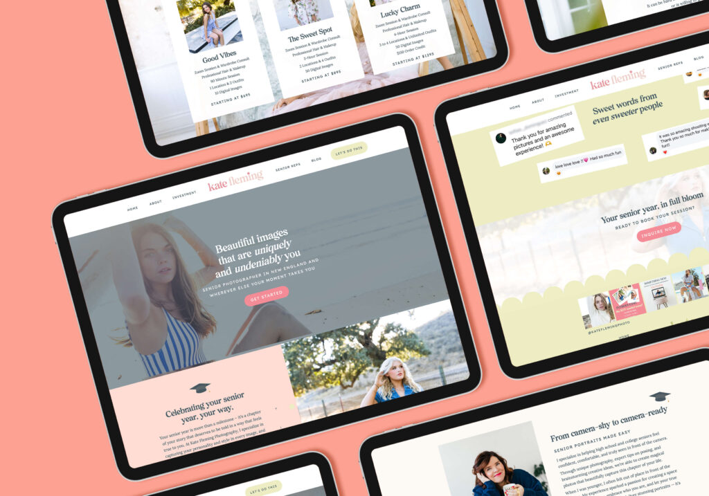
Our Goals for the Project
Together, we mapped out a vision for the new Kate Fleming Photo brand and site that would:
- Build a Showit site optimized for SEO, clarity, and connection.
- Reflect her fun, confident, personality-packed energy.
- Speak directly to seniors and creative professionals looking for a senior photographer who can make them feel bold and beautiful.
- Establish a high-end, elevated visual identity that still felt approachable.
The Transformation
Before:
- A generic online presence that failed to stand out in a crowded photography market
- Brand elements that felt disconnected and lacked personality
- Website structure that wasn’t optimized for search engines or conversions
- Marketing materials that didn’t effectively speak to her ideal clients
- A business owner feeling frustrated and limited by her brand’s presentation
After:
- A cohesive, distinctive brand identity that resonates with her target audience
- A strategically designed website that showcases her work while guiding potential clients to book
- SEO-optimized structure and content that improves her visibility in search results
- Marketing materials that authentically reflect her personality and service offering
- A confident business owner equipped with tools that support her growth goals
Intentional Design as a Business Investment
Kate’s brand illustrates a fundamental truth for small business owners: your brand and website aren’t just aesthetic choices, they’re business tools that can either limit or scale your success.
While DIY solutions and templates may seem cost-effective initially, they often create limitations that affect your business’s growth potential. Professional design is about strategically positioning your business to attract ideal clients, communicate your value, and convert visitors into customers.
As Kate discovered, investing in professional brand and web design isn’t an expense, it’s a strategic investment that delivers returns through:
- Higher-quality leads who understand your value
- Improved conversion rates from visit to inquiry
- Enhanced perception of your business’s professionalism
- Clearer communication of your unique offerings
- Stronger position against competitors
- Time saved through efficient systems and processes
If you’ve been making do with DIY design solutions while knowing your business deserves more, maybe it’s time to consider what a strategic brand and website redesign could do for your business.
Like Kate, you may be transitioning to a new phase of business or shifting your target audience and feeling limited by your current brand. Whatever your specific situation, remember that your brand and website should be working as hard as you do to grow your business.
Visit Kate Fleming’s website to see intentional design in action, and when you’re ready, let’s chat.

Leave a Reply


Favorite Resources
Back to the Blog
Our Services
Read more from the blog for more glimmers of creative inspiration from the KBD studio.
Explore our services for custom brand and website magic designed to help you shine in your niche.
Discover our favorite resources of must-have tools, trusted partners, and exclusive affiliate links.

