

Website Design for Female Entrepreneurs: What Actually Drives Inquiries
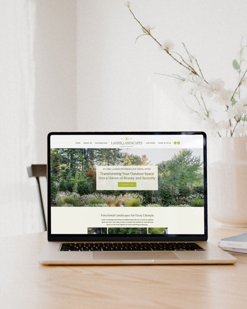
The kind of website design for female entrepreneurs that actually gets results doesn’t happen by accident. It happens when you get intentional about what your site says, how it feels, and how it guides someone from stopping by while they’re “just browsing” to heading to your contact form thinking, “I have to work with her.”
Whether you’re still rocking a DIY site from three years ago or you’ve already invested in a custom site that just doesn’t feel like you anymore, there comes a moment when you realize: this thing needs to do a wholeeee lot more than sit on the internet and look halfway pretty.
As a service-based female entrepreneur, your website should be a living, breathing extension of your business. It should warmly welcome your dream clients in, answer their unspoken questions, and guide them toward inquiring with you. And my goal? For it to do all that without you ever having to lift a finger.
The words on your website matter, but so does the layout, the flow, the visuals, and all the thoughtful little details that make someone think, “If she puts this much care into her own brand, I can trust her with mine.”
Your Website Isn’t For You (It’s For Them)
Sure, it might be fun to obsess over fonts, colors, and photos, but the hard truth is this:
Your website isn’t actually about you. It’s about the person on the other side of the screen, wondering if you’re the one who can help them.
When a potential client lands on your site, even for a few seconds, they’re wondering:
- Am I in the right place?
- Does she work with people like me?
- Does she understand what I need?
- Is this going to be worth the time, money, and energy?
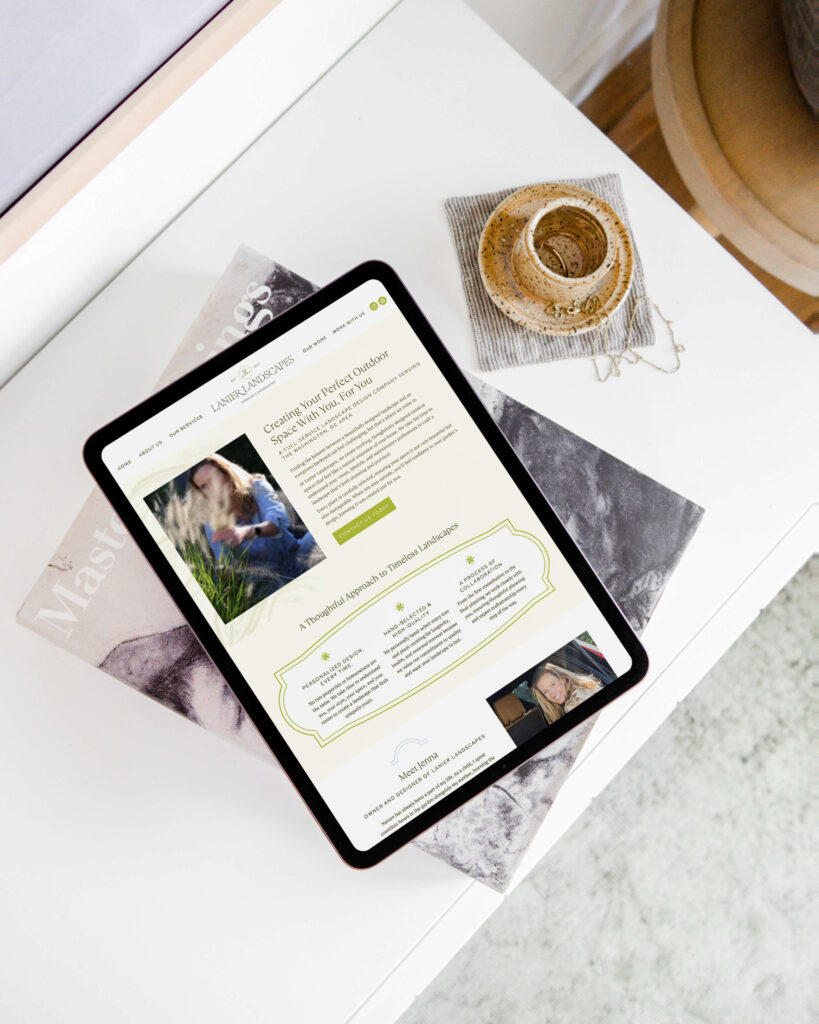
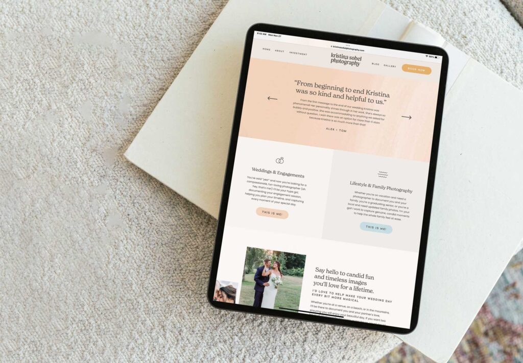
Your visuals and layout answer those questions just as loudly as your copy does. A clean, strategic hero section with a clear headline and a single main call-to-action says, “You’re in the right place. I know exactly what I do and who I do it for.” A cluttered, busy header with five competing buttons and a vague tagline says, “Good luck figuring this out.”
How to Drive Inquiries on Your Website
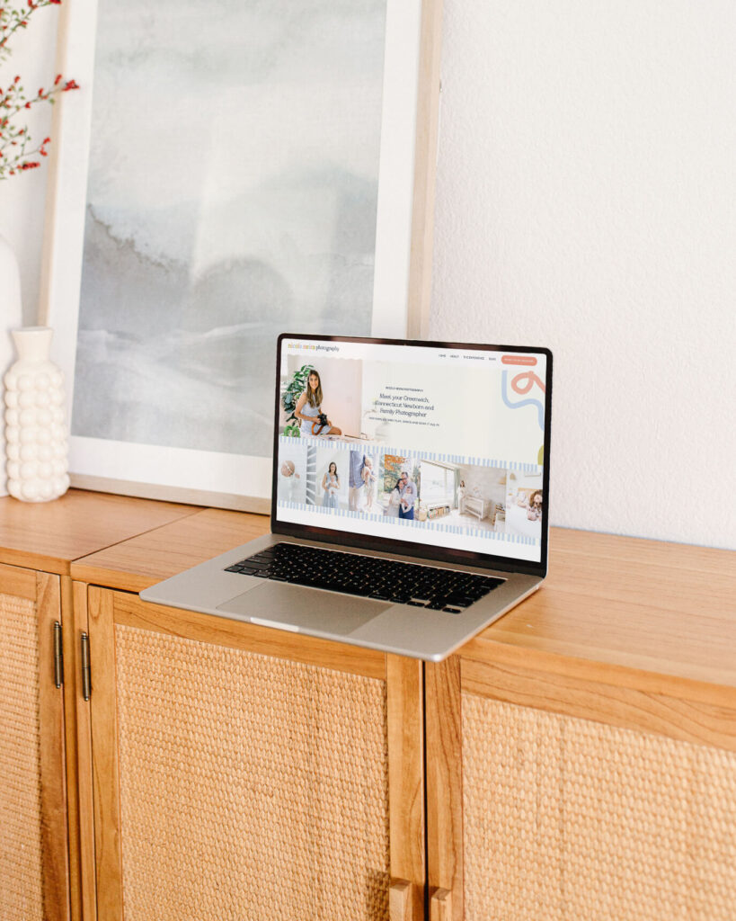
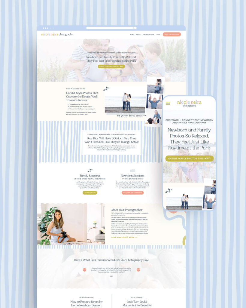
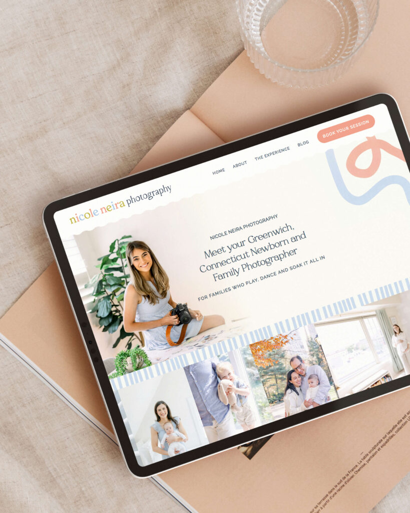
Think of your homepage as the first “micro-experience” inside your brand. The moment a visitor lands there, they should be able to understand, at a glance, what you offer, who it’s for, and where to go next. That clarity comes from:
- Clear, unfussy language that states what you do and who you do it for.
- Design that feels calm and confident, with a single primary call-to-action that stands out.
- Imagery and layout that reflect the transformation you create, not just the tools you use.
For example, a photographer might say, “Candid, documentary-style wedding photography for couples who care more about real moments than perfect poses.” A copywriter might lead with, “Story-driven website copy for creative brands ready to sound as professional as they are.” Both of these examples are specific, grounded, and centered on the client, not the service provider.
When your website looks and sounds like it was created specifically with your dream client in mind, they immediately feel seen. And feeling seen is the first step toward feeling confident enough to inquire.
Answer Their Questions Before They Even Ask (With Design, Too)
One of the most powerful things your website can do is make someone think, “Wow, it’s like she read my mind!”
That magic happens when you anticipate not just the questions your dream client has, but also how they naturally move through the information on your website.
Think back to the last time you considered investing in a service. You probably wondered:
- What exactly am I getting?
- How does the process work from start to finish?
- How long will this take?
- What will you need from me?
- What if I’m “too small” or “not ready”?
Your services page can answer all of these questions in copy, but the actual design can support their decision to move forward, too.
A step-by-step process laid out in a clean flow, with icons or illustrations and gentle scroll-triggered animations, feels like someone taking your hand and walking you through. A dense wall of text with no visual breaks feels like homework.
On your services page, think about using section breaks and headings to visually group information so they never feel lost or overwhelmed. You can even design a simple timeline or roadmap graphic that shows the journey from inquiry to offboarding, letting them see the entire partnership at a glance.
When your site answers their questions with both words and thoughtful design, your visitor relaxes. They don’t have to work to understand you or send an awkward “I have a random question” email. They can simply exhale and continue down the page toward that inquiry button.
Let Your Personality Show Up in the Design
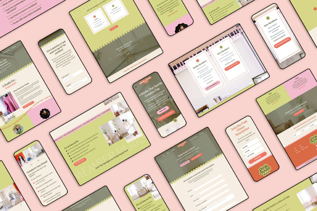
Strategic website design for female entrepreneurs means letting your personality, story, and values show up not just in your copy, but in the visuals, textures, and tiny interactions sprinkled throughout your site.
Now, don’t overshare or turn your homepage into a scrapbook. Just give enough of yourself that someone can think, “Okay, I like her energy and her attention to detail.”
Beyond the words you choose, you can use behind-the-scenes shots, your studio, your favorite coffee mug –– styled in a cohesive, way that still feels like you.
You might even incorporate custom graphics or doodles that nod to your process, your location, or your clients’ world.
Color itself can be used intentionally to draw attention. Maybe as a warm accent behind your origin story, a softer palette around your values, and a bold hue for the CTA’s.
Animations are fun, but I like to use them in a way that doesn’t overpower the purpose of the site. Things like hand drawn underlines that gently appear under your mission statement, or a polaroid-style photo that “floats” slightly on hover. These tiny moments of delight make your brand feel human and considered.
Compare these two experiences:
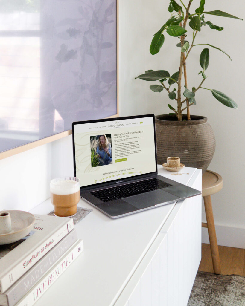
One About page is a basic template with a centered headshot, a short paragraph, and a standard “Learn More” button. The other opens with a candid photo of you in your element, your mission statement elegantly types in as you scroll, and your story unfolds in well-paced sections with custom graphics, all leading to a warm invitation to explore your services.
The second version isn’t just prettier, it’s more human.
It makes your site visitor feel like they’re already in conversation with you with an emotional connection, supported by thoughtful design, making the idea of filling out your inquiry form feel less like a transaction and more like the next step in a relationship.
Flow and Layout That Gently Guide Them to “Yes”
A beautiful website is lovely, but beauty without strategy is just digital wall art. If someone can’t intuitively find their way through your pages or figure out what to do next, the design isn’t doing its job — and that has everything to do with flow.
Every page on your site should have a clear visual journey.
Think of how you’d walk someone through your process on a discovery call: you wouldn’t dump every detail at once or jump randomly between topics. You’d guide them, step by step, from big picture to specifics to next steps. Your layout should mirror that same calm, intuitive progression.
On your homepage, that might look like a hero section that clearly states what you do and who you serve, followed by a highlight of your core offer, a taste of credibility, a warm introduction to you, and finally a grounded invitation to inquire. Visual hierarchy through size, color, spacing, and alignment can do the heavy lifting, telling your visitor where to look first, second, and third, while keeping everything else clean and supportive.
The goal is a scroll, not a scavenger hunt.
Custom Elements and Animations That Add Personality Without Distraction
Custom elements like section dividers, overlapping photos, or hand-drawn accents can be a great addition for website design for female entrepreneurs, but the key is restraint. A single custom cursor, or one playful animation on your buttons, can feel delightful. But 10 competing animations on every scroll? It breaks up the flow we’re after, doing more harm than good.
All these little design details that make a website feel premium and alive can absolutely help drive inquiries, but only when they’re in service of clarity and connection.
Thoughtful motion can draw attention to your most important messages or calls-to-action, help break up long pages and reward people for scrolling, and showcase your work in a more dynamic, immersive way. It can also communicate your personality.
Custom elements might also look like unique icon sets for your services, hand-drawn flourishes that nod to your creative process, or branded patterns woven into backgrounds and borders. These details signal craftsmanship and show your ideal client the amount of thought put into your site, which is especially powerful for service-based female entrepreneurs whose clients are evaluating their taste and attention to detail.
The goal is not to turn your site into a carnival. Overwhelming motion can actually block inquiries by making people feel overstimulated or confused. But a few intentional, on-brand interactions can make your website feel like a high-touch experience before anyone ever speaks to you.
Crafting a Calm, Confident Experience Through Design
The emotional experience of your website is just as important as the visuals and the copy. If your site feels chaotic, cluttered, or disjointed, your dream client isn’t going to push through the friction to find your inquiry form. They’ll simply click away and tell themselves, “I’ll come back later,” even though they probably won’t.
A supportive, confidence-building site experience is built through design decisions like simple, intuitive navigation with clear labels and a limited number of top-level pages, so visitors always know where they are. Clean, readable typography with enough contrast and generous line spacing means they never have to squint or zoom in. Consistent colors, fonts, and imagery keep everything feeling cohesive and aligned with your brand personality.
Your website can give that same feeling of being spacious, grounded, playful, and warm, but never chaotic. When the design feels calm and intentional, taking the next step to inquire doesn’t feel like a big, scary leap. It feels like the natural, obvious thing to do. They’re already comfortable in your world—you’re simply offering to deepen the relationship.
Design Details That Signal “You Can Trust Me”
Finally, there are the subtle details that most people can’t name, but everyone can feel. These are the design touches that make a potential client think, “If she cares this much about her own brand, she’s going to take great care of me.”
These details might include things like deliberate image curation with no random stock photos, thoughtful mobile design, and an easy-to-navigate blog page. (This can be a struggle for some Showit templates out there! 😬)
Even your forms and confirmation messages can be on-brand, so the “thanks for inquiring” pop up feels like part of your world, not a generic afterthought.
Your 404 page or your footer can carry your voice and visuals, too. A playful line on a missing page, or a well-designed footer with a mini-bio, newsletter opt-in, and clear navigation, says, “I see you. I’ve thought about your entire journey, even to here.”
These small touches add up. They build trust before you ever send a proposal and communicate that you’re not just talented—you’re thorough, reliable, and deeply invested in creating a beautiful experience.
For service-based female entrepreneurs, that level of care is often exactly what your dream clients are looking for.
Website Design for Female Entrepreneurs: How to Make Your Website Work as Hard as You Do
Website design for female entrepreneurs that actually drives inquiries isn’t about chasing the latest trend or cramming in as many animations as possible. It’s about building a space that clearly speaks to your dream client, answers their questions, reflects who you are, and uses thoughtful design to gently guide them toward working with you.
When your site is doing its job, your dream client will feel seen, understood, and supported — through both your words and your visuals. They’ll see what’s possible on the other side of working with you, and inquiring will feel safe, exciting, and like the most natural next step.
If your current website feels more like an online business card than a true partner in your growth, this is your nudge. You don’t have to burn it all down. Start by refining your core pages, smoothing the flow, and inviting your personality to show up not just in your copy, but in every visual decision.
You’re building more than a website. You’re crafting the doorway into a business that holds your vision, your clients, and your next level. And that doorway deserves to be as thoughtful, beautiful, and intentional as the work you do inside it.


Read more from the blog for more glimmers of creative inspiration from the KBD studio.
Explore our services for custom brand and website magic designed to help you shine in your niche.
Discover our favorite resources of must-have tools, trusted partners, and exclusive affiliate links.


