The Year of Whimsical Design, Analog, and Heart-Centered Branding

Scroll for five seconds, and you’ll see it: the shift to whimsical design and aesthetics. After years of ultra-minimal, hyper-polished, clean-and-neutral everything, there’s a new mood in the air full of whimsical design, textures, scribbles, watercolor washes, and purposefully imperfect fonts. Brands are starting to feel less like sleek machines and more like, well, people.
Welcome to what I’m calling the Year of Whimsy and Analog. If you’ve been craving branding that feels warm, human, and a little bit magical, 2026 is your year. Let’s unpack why whimsical branding is having such a moment and what it means for your business.
Why We’re Tired of Perfect (And What That Means for Your Brand)
For a long time, “professional” became synonymous with “minimal.” Cream backgrounds, thin sans-serifs, and perfect grids.
It might have made sense at the time, but now? People are tired. We’ve been marketed to, funneled, and “optimized” within an inch of our lives. The result? A sea of brands that look eerily similar and feel emotionally flat.
Human brains don’t fall in love with perfect. We fall in love with stories, quirks, and dimension. The tiny things that feel like, “Oh, this is made for me.” That’s exactly why whimsical design is booming. Whimsy doesn’t mean childish, it means emotionally resonant. It’s the visual language of nostalgia, personality, and delight.
In 2026, what’s standing out isn’t the most flawless brand. It’s the most honest one. The ones with a little wobble in the lines, a little ink texture on the page, a little bit of the maker still visible in the final design.
The Rise of Analog: Why Everyone’s Craving “Real” Again
Look around and you’ll see it everywhere:
Friends buying vinyl records and spin tables again, film cameras selling out, people writing actual letters just for the joy of putting pen to paper (shout out to Pearl, one of by business besties and current pen pals!)
We’re living in an era of everything-digital, everything-instant. And yet, the more time we spend online, the more we crave the slow, tactile, analog world. It’s not just a trend, it’s a reaction. Analog feels grounding. It reminds us we have hands, not just thumbs that swipe.
That same longing shows up in branding and whimsical design.
Vinyl records give us that warm, crackly sound. In design, watercolor textures give us that same feeling visually… soft, layered, imperfect in the best way.
Film cameras give us unpredictable light leaks and grain. In branding, hand-drawn illustrations and fonts echo that sense of surprise and humanity.
Handwritten notes feel special because someone slowed down and made something just for you. A handwritten-style logo or a loose, sketchy icon can create that same emotional “this is just for you” effect on your website or packaging.
In 2026, analog-inspired whimsical branding isn’t just about looking cute. It’s about signaling, “There’s a real human here. I care about the details. I’m not trying to be everything for everyone, I’m here to connect with you.”
Why Whimsy Works: The Strategy Behind the Magic
Let’s clear something up: whimsical design is not random or childish. It’s not just tossing doodles and pastel colors at your logo and hoping for the best. Whimsy branding is every bit as intentional and strategic as any other style of design.
Here’s the secret about whimsical design, every whimsical choice should be tied back to the story you’re telling.
Hand-painted icons don’t just look cool; they say, “This brand is crafted with care. Nothing here is copy-and-paste.” Soft textures don’t just fill up space; they wrap your brand in warmth, giving clients a subtle sense of safety and approachability. Imperfect lines don’t scream “unprofessional”; they whisper, “You can trust me. I’m real. I’m not hiding behind a mask.”
Think of your brand like a film. The story isn’t only in the dialogue; it’s in the details. The film grain, the lighting, the costume choices, the songs in the background. Branding works the same way. That slightly off-center illustration, the way your typography slants, the little squiggle by your call-to-action button… They’re all tiny cues that tell your audience how to feel.
Whimsical branding works because it taps into emotion and memory. It reminds your audience of storybooks, handwritten notes, vintage shops, rainy-day journals, or favorite childhood cafés. When those feelings are aligned with your brand values and offers, whimsy becomes a powerful conversion tool, not just something “pretty.”
A Peek Behind the Curtain: Whimsy at Work with Page & Pantry
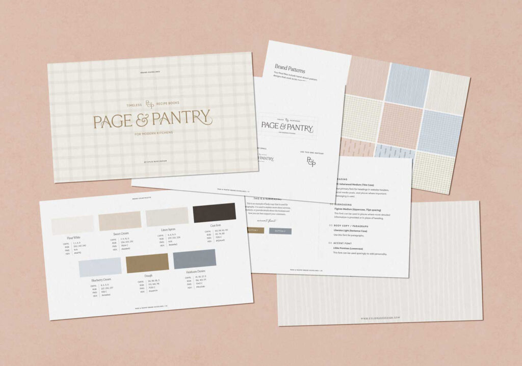
Before “analog” and “whimsy” became buzzwords, I was already elbow-deep in paints, sketchbooks, and messy mockups. One of my favorite examples of whimsical branding in action is the visual identity I created for Page & Pantry, a cozy, story-soaked brand that lives at the intersection of literature and baked goodies.
Page & Pantry’s heart wasn’t just “we sell things.” It was: “We create warm, nostalgic experiences that feel like a morning spent baking recipes that remind you of your grandmother.”
To bring that to life, we didn’t reach for a sterile template or a harsh black-and-white palette. Instead, we built a visual world that felt like stepping into a sunlit, well-loved kitchen with a novel open on the counter.
The logomarks leaned into soft serifs with custom touches on every letterform, so nothing felt generic or off-the-shelf. The brand suite included hand-painted watercolor icons from mason jars of herbs to glass oil bottles, each one slightly imperfect in the way real, well-loved kitchen tools are. You could almost smell the bread in the oven and hear the pages of a cookbook turning.
We paired gentle browns, soft muted hues, and faded inky blues that felt like they had stories to tell. The print concepts, and marketing materials all carried these handcrafted elements through.
The reaction from their test audience confirmed what I already knew about whimsical branding: people don’t just see it, they feel it. Page & Pantry’s visuals didn’t shout for attention, they created an atmosphere. Instead of just another brand, it became a place you wanted to step into, linger in, and come back to.
That’s the power of thoughtful whimsical design: it turns your brand into a world people want to inhabit, not just an image they scroll past.
Whimsy With Intention: How to Avoid the “Random Cute Stuff” Trap
Here’s the thing: slapping stars, lace, flowers, and squiggles on a template doesn’t make your brand whimsical, it just makes it busy. True whimsical branding is not chaos. It’s intentional, aligned, and deeply rooted in your story.
Pretty without purpose rarely converts. Pretty with meaning does.
When I design a whimsical brand, every mark has a job. Those hand-painted icons might guide someone’s eye to a call-to-action. That swoosh under your headline might subtly divide content so your reader doesn’t feel overwhelmed. That playful serif font might be chosen because it balances your more refined logo, signaling that your brand is approachable yet expert.
Whimsy should support clarity, not fight it. Your dream client should be able to land on your site or Instagram and immediately feel, “I get what she does, and it feels like it was made for me.” If your visuals confuse, distract, or feel like twelve different personalities at once, that’s not whimsical branding. That’s noise.
As you Consider Whimsical Design, Keep These Questions in Mind
What do I want someone to feel when they encounter my brand?
How can my colors, textures, fonts, and illustrations support that feeling?
Where can I add delightful, human touches that still make it easy to understand what I do and how to work with me?
Does Your Brand Feel Like a Template or a Story?
Be honest with yourself for a second. If you scroll through your own branding and website right now, does it feel like: “Yup, this could belong to any business whatsoever”?
Or does it feel like: “This could only belong to me”?
The brands that will stand out are the ones that feel like a whole, living story. Whimsical, specific, and unmistakably theirs. The era of faceless, copy-and-paste branding is fading. The era of meaningful design is here.
Your brand can be both art and strategy. It can be whimsical and profitable. It can feel like a cozy, personality-filled home your clients want to return to again and again, while still clearly communicating your offers, your process, and your value.
If you’re reading this and thinking, “I want that. I want my brand to feel like home, like art, like strategy all braided together,” consider this your invitation.
Whimsy isn’t about being silly or childish. It’s about being brave enough to show your heart. To let your brand breathe a little. To let your story guide the visuals, instead of the latest template.
If you’re craving whimsical branding that feels warm, nostalgic, intentional, and uniquely you, this is your moment. Let’s build a brand that feels like stepping into a favorite story, one your dream clients never want to put down.
If you’re ready for a brand that feels like home, art, and strategy all in one, I’d love to help you create it, let’s bring your whimsy vision to life.

Leave a Reply


Favorite Resources
Back to the Blog
Our Services
Read more from the blog for more glimmers of creative inspiration from the KBD studio.
Explore our services for custom brand and website magic designed to help you shine in your niche.
Discover our favorite resources of must-have tools, trusted partners, and exclusive affiliate links.


