


Elements of Branding in Marketing: Textures vs. Illustrations
Branding textures and brand illustrations are two of the most powerful visual tools a brand can use, and understanding the difference can completely shift the look of your brand and help you know exactly where to invest.
The first thing you need to know? The right elements of branding for your package really come down to what your brand needs most right now.
If you’re looking to build recognition, add character, and communicate something specific, illustration is likely your best starting point. If your brand feels flat, pattern work might be the missing piece.
For many of my brand identity package clients, illustration is where we reallllly inject personality. It’s where we translate “I want my brand to feel like a cozy coffee chat” into visuals that your audience can actually see and feel connected to.
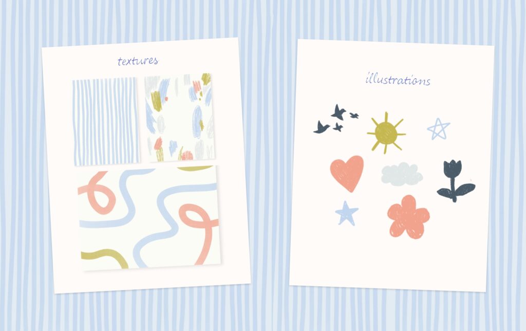
Illustrations tend to be the right choice for branding elements when:
- You’re selling something intangible, like a service, process, or experience. Icons and characters can make that feel tangible and easy to understand.
- You want to build recognition with a distinct style can become just as recognizable as your logo.
- You’re looking to differentiate in a crowded space. If everyone else in your industry uses stock imagery and generic icons, custom illustrations immediately set you apart.
- You communicate heavily on social media or in education-based content. Illustrated diagrams, icons, and moments of whimsy can make your content more engaging and shareable.
If your brand currently feels a little flat or “template-y,” pattern and texture work might be the missing layer.
Textures and patterns are especially helpful when:
- Your website feels like a basic template, even after you’ve added your logo and colors. A few well-placed patterns can instantly make it feel more custom and on-brand.
- Your social feed looks disjointed. Consistent background textures and pattern use can tie diverse content together, visually.
- You’re investing in packaging or print materials.
- You want your brand to feel more elevated without going “louder” or busier. Subtle textures can add richness while still feeling calm and minimal.
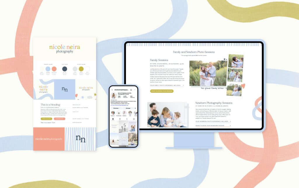
At the end of the day, both illustration and pattern work exist to make your brand feel more intentional, more memorable, and more like you. The right combination depends on your brand personality, your goals, and where you show up most often, such as your website, your packaging, or your social media feed.
If you’re not sure which direction is right for your business, that’s completely normal. My goal as your brand designer is to help you figure out exactly how your branding elements can work together to bring your vision to life in a way that feels cohesive, strategic, and full of personality.
“When your dream clients see these elements repeated consistently, your brand starts to feel more human, more intentional, and a wholeeee lot more memorable.”
Brand Textures vs. Brand Illustrations
A brand identity can certainly be designed without textures or illustrations, but having them adds polish and personality to your brand and allows you to stand out in your space.
Branding illustrations are often used to tell or add additional context to your brand’s story, while brand patterns or textures are often chosen to build the world that your story lives in in a more artistic, stylized way. Knowing when to reach for each one can completely change how effective your visual identity is to your audience.
What are Branding Illustrations?
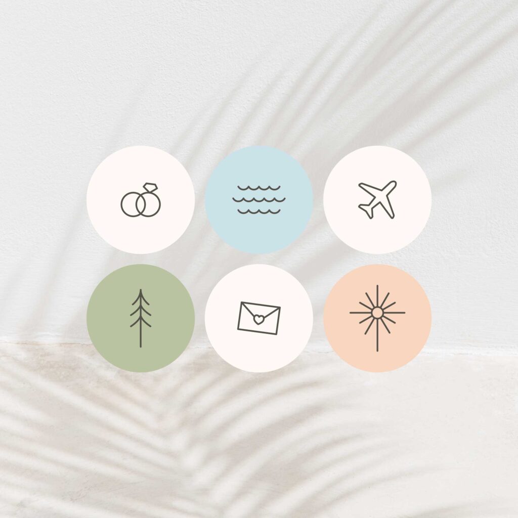
Brand illustrations are your visual storytellers. These are the custom icons and hand-drawn elements that show up front and center in your brand. This could look like friendly doodles of office supplies for your coaching brand, delicate line art for your wellness studio, or nostalgic hand-drawn icons for a specific service.

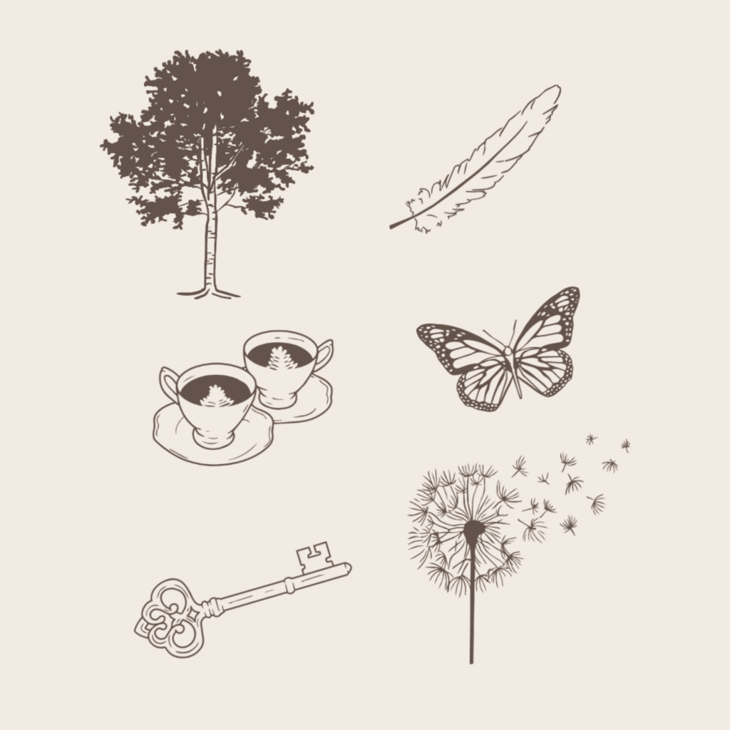
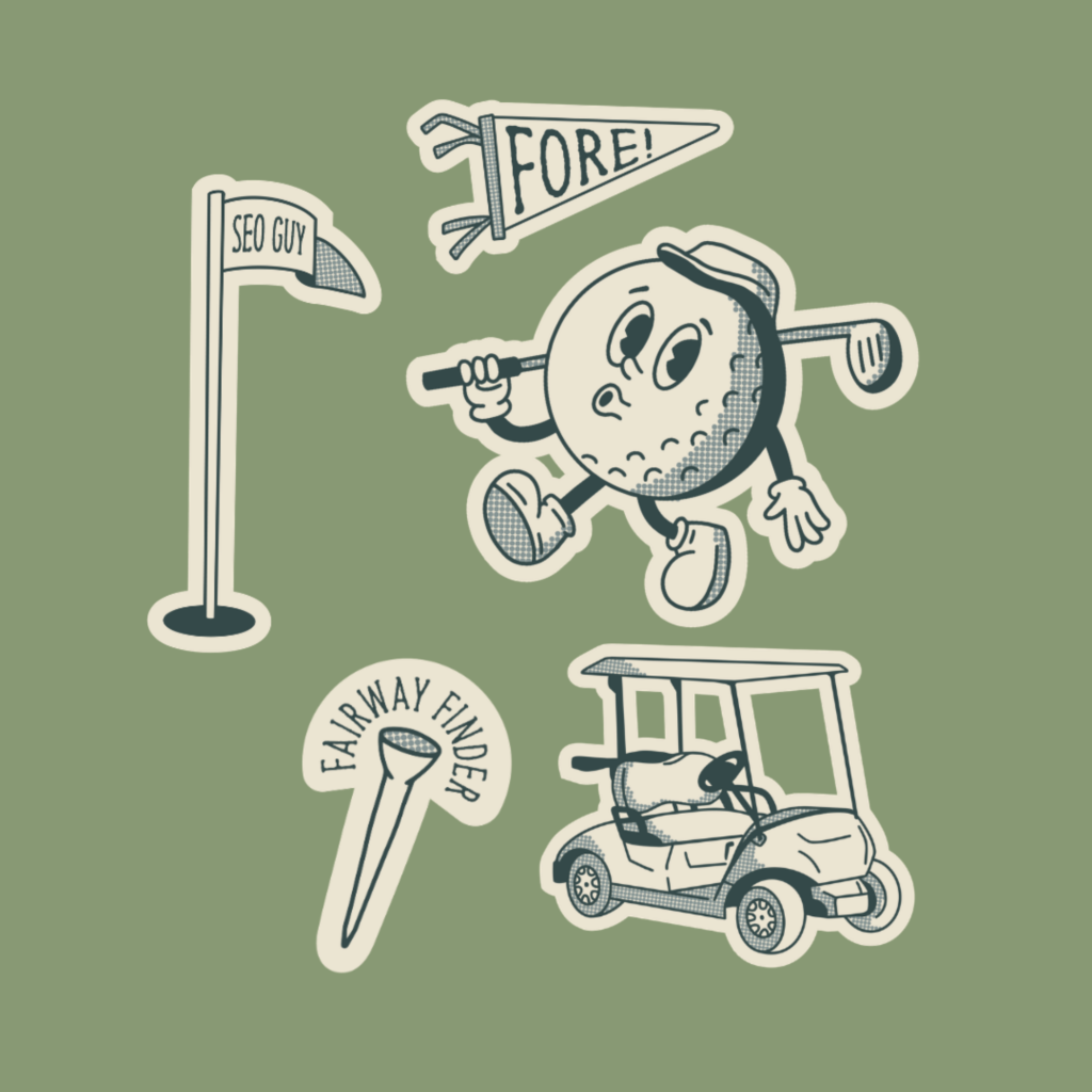
Illustrations tend to be the first thing people notice because they’re designed to communicate something specific. They can signal:
- Warmth, friendliness, and approachability
- Playfulness and creativity
- Sophistication and artistry
- Expertise and clarity (especially when used as icons for services or steps in a process)
Because they carry so much personality, brand illustrations often become little “signatures” that clients begin to associate with you. Think:
- A suite of custom icons used across on your website, social media, and price guide
- Hand-drawn line details sprinkled through your social graphics
- A tiny illustrated detail on your email footer or business card
When your dream clients see these elements repeated consistently, your brand starts to feel more human, more intentional, and a wholeeee lot more memorable.
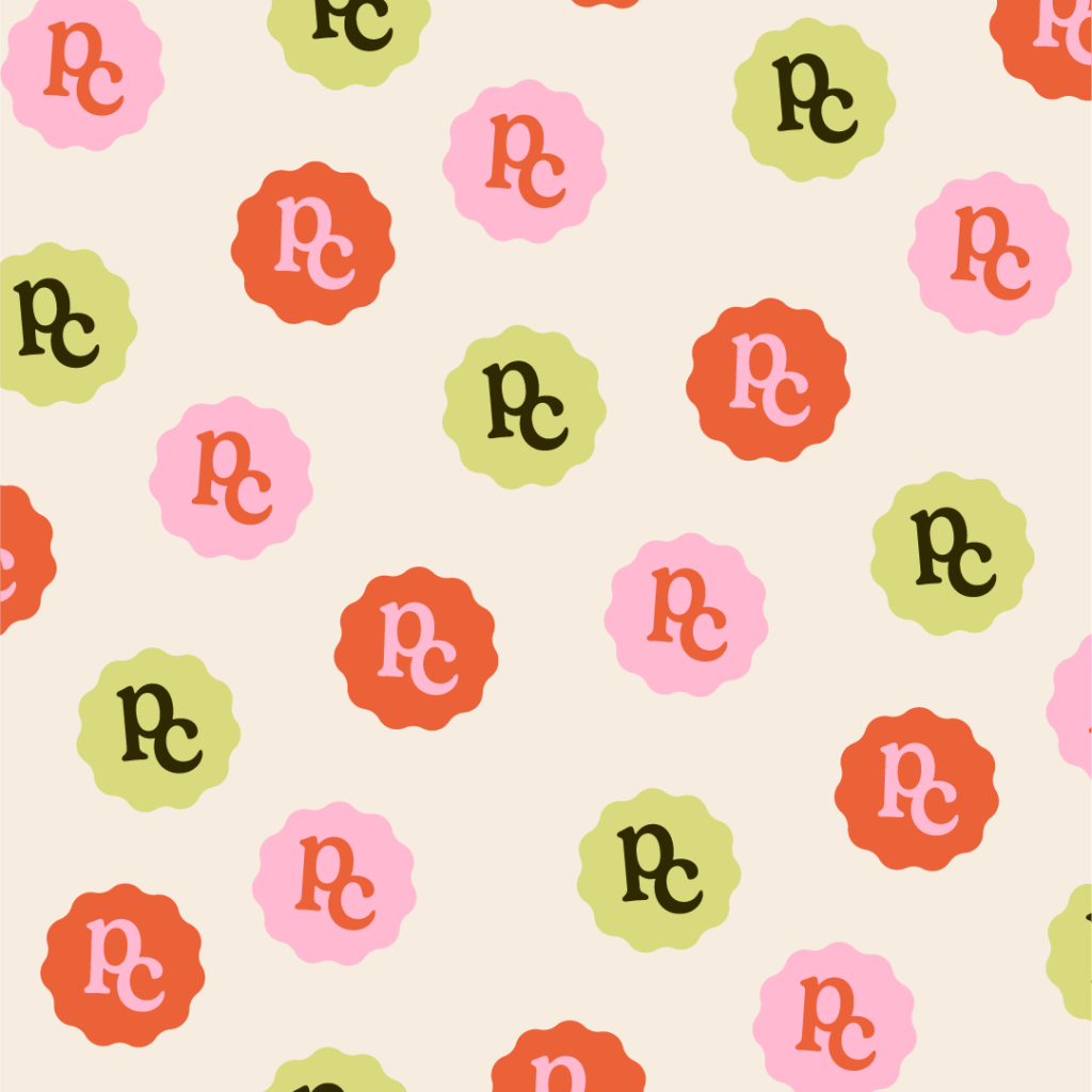
Brand Patterns: Adding Depth, Texture, and Vibe to Your Visual Identity
But illustrations are only half the story. Brand textures work in the background, setting the mood and tone before anyone even registers the details, and that’s what we’re diving into next.
What are Brand Textures and Patterns?
If illustrations are the storytellers, textures and patterns are the world-builders.
Branding textures and brand patterns work a little more behind the scenes. They’re those quiet, supportive elements behind your website copy or a textured background on a social graphic that gives everything a more polished, dimensional feel without pulling focus away from your message.
Patterns are the atmosphere builders that set the vibe for everything else on the page and give your brand a sense of depth that flat color alone can’t achieve.
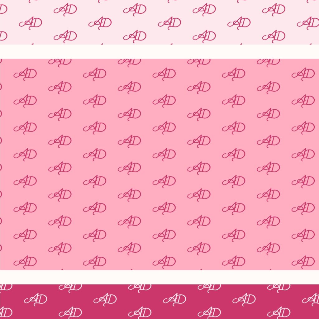
Patterns are typically repeating visual motifs:
A floral or botanical repeat for a florist or wellness brand
Geometric shapes that echo your logo for a modern creative studio
Hand-drawn icons tiled across tissue paper or packaging inserts
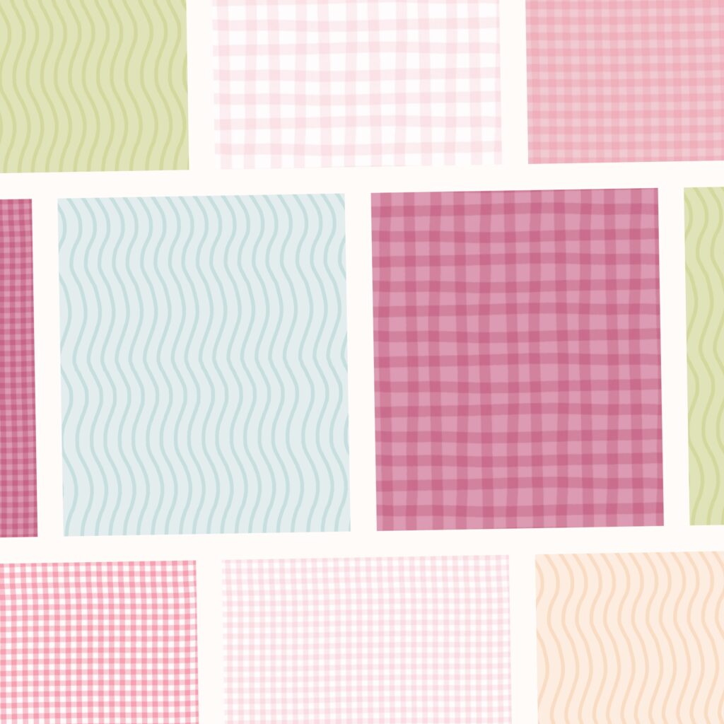
Textures can look like:
Grainy overlays that make photos feel more tactile
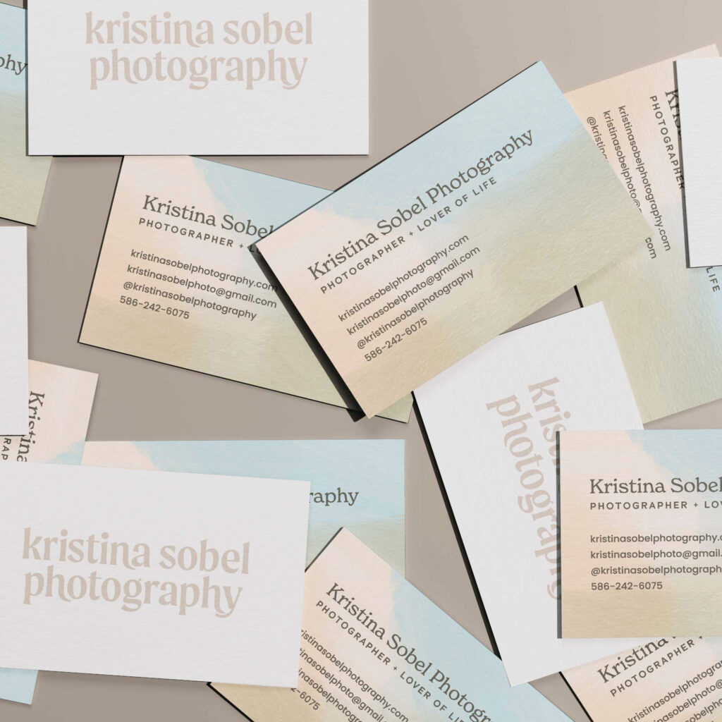
Subtle paper, linen, or watercolor backgrounds
Slightly distressed or organic surfaces that soften a clean layout
You’ll usually see textures and patterns used as website section backgrounds, packaging wrap, tissue paper, or box interiors, graphic elements in social media graphics, or subtle frames or borders around photography.
Patterns and textures help your brand feel cohesive, professional, and thoughtfully designed, even when a viewer can’t quite put their finger on why.
The Difference Between Textures and Illustrations
Both illustrations and textures influence how someone feels when they encounter your brand, but they do it in different ways.
Illustrations for Personality and Story
Illustrations tend to spark a reaction. A soft, hand-drawn element might make someone smile; a bold, graphic icon system can feel instantly confident and clear; delicate line drawings might immediately read as calm and elevated. They’re expressive, and they’re meant to be noticed.
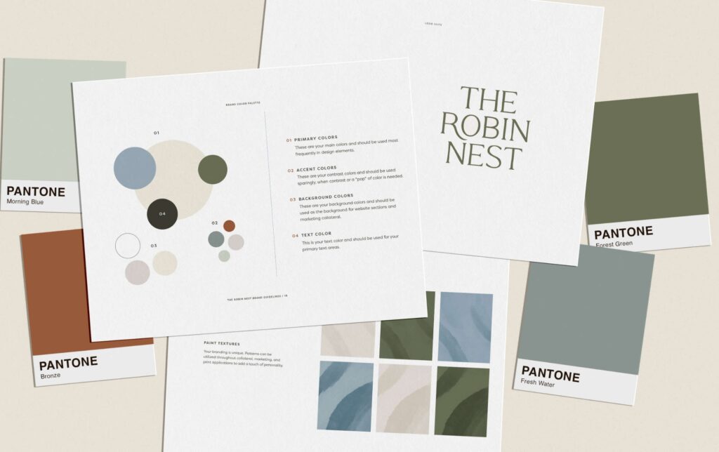
Patterns and Textures for Atmosphere
Textures and patterns, on the other hand, work more like background music. They shape how a brand feels overall, adding consistency that a viewer might not consciously notice, but absolutely feels.
When you’re clear on the emotional difference between the two, you can make much more strategic choices:
- Want to show personality and make a memorable first impression? Reach for illustrations.
- Want to build a cohesive, immersive brand experience that feels “expensive” and intentional? Invest in textures and patterns for your brand.
Why You Might Want Both Illustrations and Textures
Here’s the part I want you to know: you actually don’t have to choose!
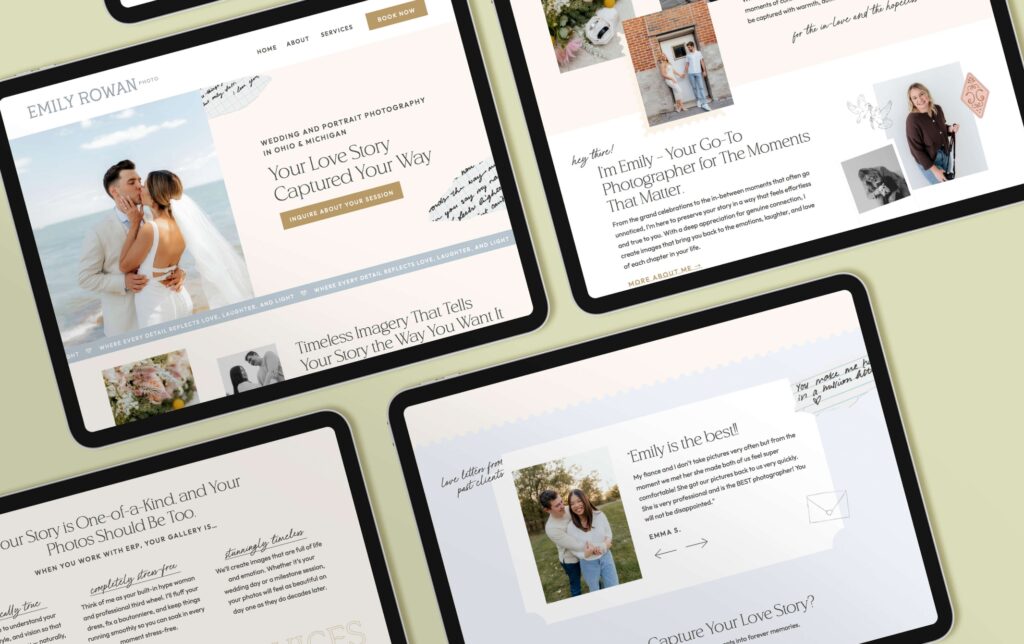
Some of the most compelling, memorable brands use both illustrations and textures together in a way that feels layered but not chaotic, just take a look at Nicole’s brand and website above for an example!
In my full brand package, we usually map out a visual hierarchy: deciding whether we want illustrations showing up as moments or personality or if we’d rather have textures and patterns as supporting elements in the background. This keeps everything feeling cohesive, intentional, not cluttered, and most importantly – custom to you and your brand.
Choosing What To Prioritize Right Now
If you’re not working with a designer yet, or you’re working within a specific budget, you might be wondering what to prioritize first: illustrations or textures?
Here’s a simple way to decide:
Start with illustrations if:
- You struggle to communicate what you do in a visual way
- Your brand feels generic and you want a clear sense of personality
- You create a lot of educational or social content that needs visual support
- You’re building a personal brand and want to feel more “present” without relying only on photography
Start with patterns and textures if:
- Your visuals feel flat
- You already have a logo and basic identity but it doesn’t feel cohesive across touchpoints
- You’re about to invest in packaging, print materials, or a new website
- You want your brand to feel elevated and polished, but still calm and minimal
And remember: you can absolutely layer these over time. Plenty of my clients begin with a mini brand package to get core foundations in place and end up circling back for custom patterns, illustrations, or website design as they grow. There’s no one “right” way to build your visual world. There’s only the right way for you, your goals, and your current season of business.
Figuring Out the Right Elements of Branding for You
Branding textures and brand illustrations are both powerful, but they are not interchangeable.
Now that you understand what each one does, and how they can complement each other, you can make smarter, more strategic decisions about where to invest.
Whether you’re dreaming up a fully custom identity or refreshing what you already have, the goal is the same: a brand that feels like you, connects with your dream clients, and supports the next level of your business.
If you’re not sure whether your business needs illustrations, patterns, or a mix of both, that’s exactly the kind of strategy I help my clients with through custom brand packages and semi-custom options. Together, we can design a visual world that feels cohesive, strategic, and full of personality and one that you’re genuinely excited to show off.


Read more from the blog for more glimmers of creative inspiration from the KBD studio.
Explore our services for custom brand and website magic designed to help you shine in your niche.
Discover our favorite resources of must-have tools, trusted partners, and exclusive affiliate links.


