


Brand Patterns: Adding Depth, Texture, and Vibe to Your Visual Identity
Some brands feel instantly cohesive the moment you land on their page due to the use of custom illustrations, a fleshed-out logo suite, and beautiful brand patterns, while others feel like a collection of nice elements that don’t quite add up to a whole. More often than not, the difference comes down to the details that people rarely notice on purpose. Brand patterns are the type of brand expansion pieces that add dimension, texture, and a little extra magic that makes everything piece of your brand feel like it’s meant to be.
Where a logo introduces your brand and a brand illustration kit tells a piece of its story, a pattern sets the mood for nearly everything else around it.
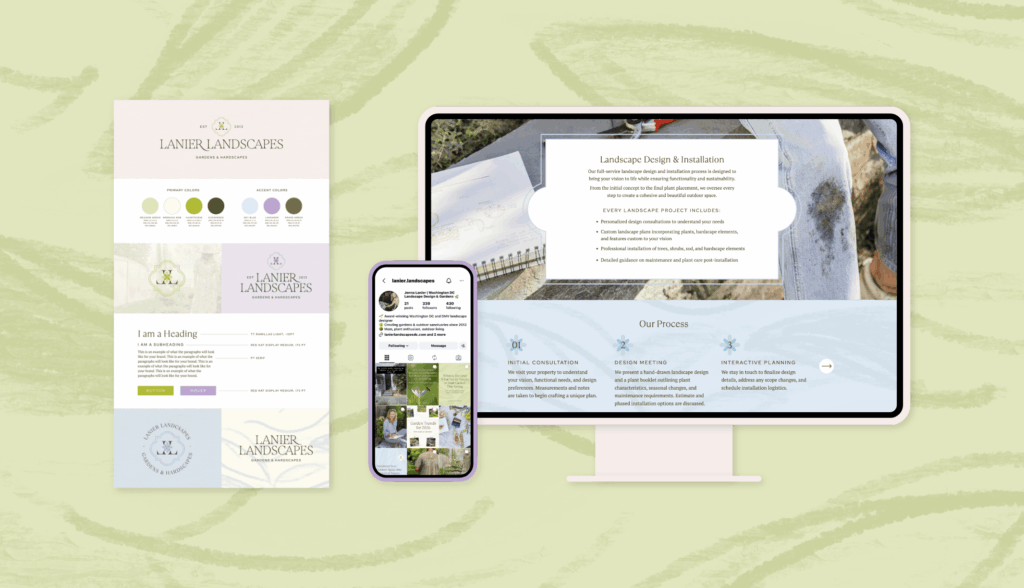
Lanier Landscapes uses their patterns across socials, business cards, and their website for ultimate consistency.
Brand Patterns Create a Certain Feeling Before Anyone Reads a Word
While brand illustrations tend to carry personality and playfulness front and center, patterns work more like the mood lighting of your brand. They set the atmosphere and add richness without competing for attention.
A soft, floral-esque pattern suite like the above for Lanier Landscapes can make a landscaping brand feel approachable and whimsical.
Meanwhile – bold, colorful, flowing shapes can make a brand like Erin’s, shown below, feel energized and confident.
Brand patterns don’t need to explain anything directly. The balance of design and subtle details within brand patterns is exactly what makes them so effective for service-based businesses and product brands alike.
They elevate a design without pulling focus away from your words, your photography, or your call to action, which means they can be used generously across a brand without ever feeling like too much.
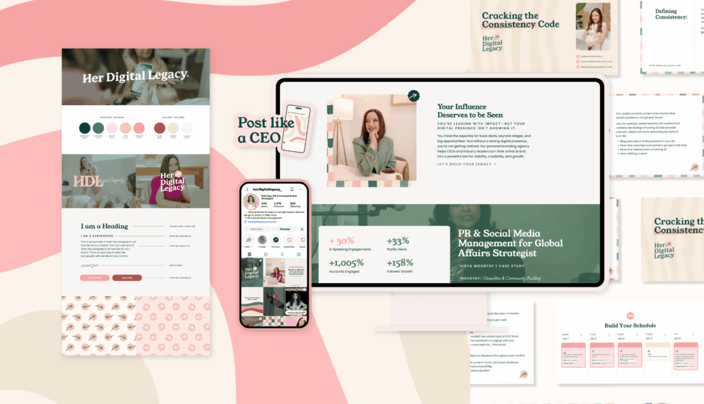
Erin’s brand, Her Digital Legacy, uses brand patterns across her social channels, website, presentations, and marketing efforts.
Where to Use Brand Patterns
Patterns are incredibly versatile and can show up in sooo many places across your brand. They work beautifully as website backgrounds, social media graphics, packaging paper, on business cards, or even on fabric for merchandise.
A pattern or texture can dress up a plain product photo, add movement to an otherwise simple Instagram carousel, or bring a sense of cohesion to an entire website design. It’s a small design element that makes a surprisingly large visual impact. A subtle pattern peeking out from behind a hero image on your homepage can add a sense of professionalism that words alone can’t achieve.
Some of our favorite places to layer in pattern include:
- Website backgrounds when tucked behind a hero or text heavy section, or a footer to add depth and visual interest
- Social media graphics to fill the background of a quote post, story, carousel slide, or a highlight cover to keep your feed feeling cohesive
- Packaging paper and stickers to turn an unboxing moment into something clients actually want to photograph and share
- Business cards and stationery to add a little charm to something that would otherwise be plain and forgettable
- In Email newsletters as a text or graphic background elements to reinforce your brand even in your dream client’s inbox
Wherever it shows up, a good brand pattern adds polish and personality, helping everything around it feels a little more finished.
Patterns vs. Illustrations: What’s the Difference?
Patterns and illustrations often get lumped together, but they play very different roles in a brand. A pattern or texture is a repeating design element, think a background texture, a printed paper, a subtle motif tiled across a hero section. It sets a mood without asking to be noticed.
Illustrations, on the other hand, are standalone artwork with a story to tell. They’re the little sketches, icons, or characters that add personality and explain something directly.
Think of it this way: patterns are the mood lighting, illustrations are the conversation. Curious which one (or both!) your brand needs? I break it all down in this post:
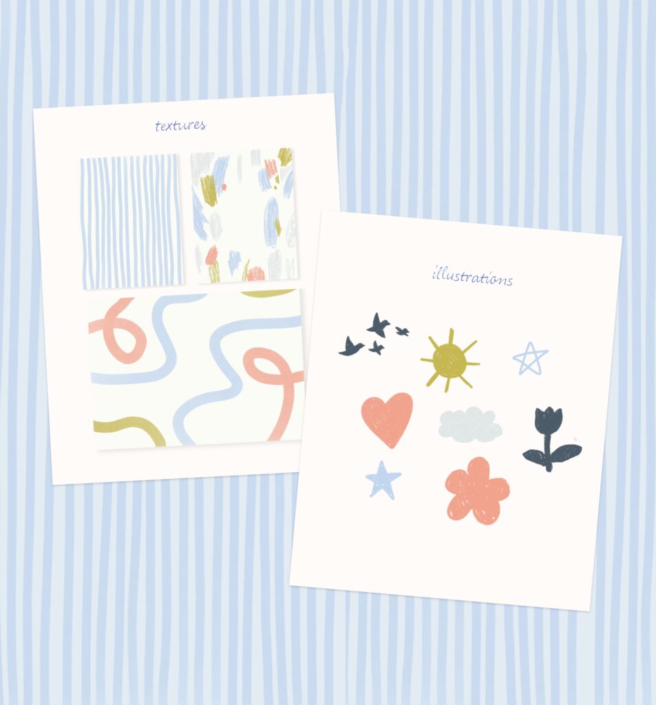
Elements of Branding: The Difference Between Textures and Illustrations
Good Pattern Design Builds Atmosphere and Emotion
Good pattern design taps into color, shape, and rhythm to create an emotional response.
- Dense, layered patterns can feel rich and luxurious.
- Loose, organic patterns can feel earthy and calming.
- Bright, high contrast patterns can feel fun and energetic.
This is what makes brand patterns such a powerful tool for setting the overall vibe of a brand at a glance, and it’s part of why they work so well as a consistent thread running through every corner of a visual identity.
A brand with a strong pattern library also gains flexibility over time. As new products, offers, or seasonal campaigns launch, an existing pattern can be recolored or resized to fit new needs, keeping everything cohesive even as the content evolves.
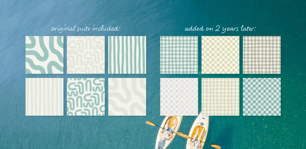
Water Camp came back two years after launch to invest in additional patterns to expand their suite.
A Few of Our Favorite Brand Pattern Styles
Every brand has its own personality, and the right pattern should reflect that completely. Some brands need something soft and painterly, and other brands need something bold and unexpected.
Bright and playful, for Nicole Neira, we created vibrant color combinations and energetic repeats to create a fun, upbeat mood that carries across every platform the brand shows up on.
Whimsical and natural, Lanier Landscapes leans into organic shapes and earthy tones for a grounded, nature-inspired feel that mirrors the work Jenna creates.
Mama Farmette embraces bold, unconventional shapes and design elements with a little bit of mystical charm, giving the brand a personality that feels the perfect amount of beautiful and bit unexpected.
Modern and geometric, for Katie Krupa Creative, we built clean, structured shapes and bold repeats to create a sharp, confident mood that stays colorful and full of life across every touchpoint.
Painterly and artful, like The Robin Nest, uses soft brushstroke textures that feel rich, artistic, and warm, adding a handcrafted quality to every graphic they appear on.
Psst. Want to see more of my work? Head to my portfolio here!
Making Brand Patterns Part of Your Strategy
The best patterns aren’t just pretty backgrounds tacked onto a website. They’re built with atmosphere in mind and chosen to reflect the feeling you want your audience to walk away with.
That’s why brand patterns part of our full brand package, alongside your logo suite and illustrations, so every piece of your identity is working together from day one instead of feeling like an afterthought. When brand patterns are woven thoughtfully into your identity, they add polish, personality, and dimension in a way that feels cohesive rather than repetitive.
If your current visuals feel a little flat or forgettable, a custom pattern set might be exactly the finishing touch your brand has been missing. Get in touch today to inquire about our branding services and reach out today!


Read more from the blog for more glimmers of creative inspiration from the KBD studio.
Explore our services for custom brand and website magic designed to help you shine in your niche.
Discover our favorite resources of must-have tools, trusted partners, and exclusive affiliate links.


